Variable Fonts VF Guide

Variable Fonts: a new interface for typographic expression

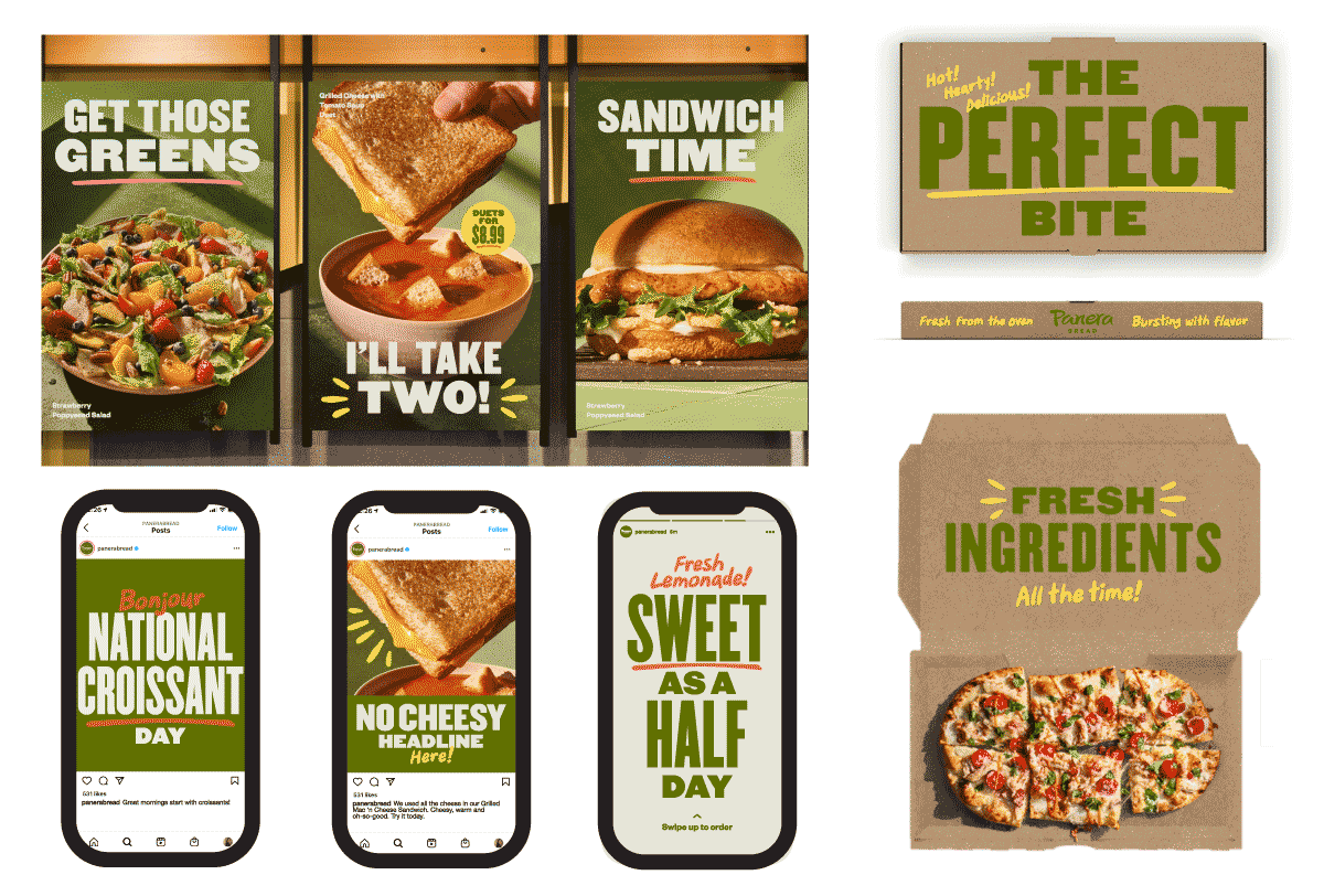
Since the new Open Type format was released in 2016, variable fonts have been a rich area for design and research at Occupant Fonts. It’s clear that variable fonts offer new typographic opportunities, with sliders offering precise controls in wide range of axes. We share some work here that demonstrates some of these possibilities, including customized axes for branding, refined reading experiences for digital publishing, and the freedom to expand typographic combinations.

We are also curious about the ways in which variable fonts can be activated beyond sliders. What is most promising about variable fonts is not necessarily a new way to select a font style — a slider replacing a dropdown menu — but rather, the ability to programmatically specify a precise point in a font’s design space. We have been collaborating with designers to produce experimental web specimens that use variable fonts with fresh perspectives, using variability as a medium in and of itself. We’re excited to expand the possibilities of the variable font format as a new means to connect with text.

R
Magmatic, our first variable font, was released in January 2020. You can read about how we came up with new point structures to push the design space to extremes in our design notes.

Variable Fonts & Branding

Built-in optical sizing for platform flexibility

Branding often features typography on all kinds of media — including large-scale signage, print packaging, websites, and social media. This requires a typeface optimized for different sizes, and a variable font with an optical size axis can offer robust legibility for multiple platforms with a single font file.

Custom glyphs as branding assets

Many design concepts leverage a unique glyph or decorative component — a fifth element — as part of the identity. Here, variable fonts can be an ideal format to express this unique element, as it could hold variations on a theme, be easily animated, and parametrized to combine with other parts of the brand identity.

Sample usage scenarios, including storefront large posters, packaging, and instagram posts, provided by JKR.
A custom underline in the same style, with a variable width, can be paired with words of any length. We prepared 3 versions of the underline that can easily be toggled through stylistic alternates.

Panera Bread with JKR

When design agency Jones Knowles Ritchie came to Occupant to develop a custom hand-written typeface for Panera, it was clear that the typeface will need to be used across different media. A variable font with an optical size axis helped the details of the handwritten script maintain legibility across platforms.

Fresh!
The optical sizing in action with Starter Script, a custom typeface developed for Panera Bread.

Another part of the branding direction was a hand-written underline, designed to be a decorative element that tied together the other sans-serif typeface used in the brand assets. We offered a custom underline typeface with a variable width axis that could be adjusted for words of any length, at any size.

Read more on our Custom Portfolio

Variable Fonts & Digital Publishing

Customized reading experiences for screens

Not only do variable fonts offer flexible tools for designers, they can also serve as tools for their audience. Websites and devices using variable fonts can provide readers access to the same parameters to customize typography according to their preferences.

Grade adjustments and refined dark mode support

Applications increasingly support “dark mode,” with white text on a dark background. However, typographic adjustments are less common. With variable fonts, we can fine-tune the behavior of text across various background colors for consistent legibility, such as with a custom Grade axis.

Device-width responsivity

The width axis is a standard variable that can facilitate designs that adapt across screen widths. As our landscape of device dimensions and resolutions continues to evolve, variable fonts can flexibly adjust to screens ranging from a wide-screen monitor to a compact mobile phone.

Inside Paragraphs, E-reader

In addition to the usual process of reviewing printouts, Cyrus Highsmith used a Kindle to proof his new textface, Occupant Oldstyle. In response to this, designer/developer Minkyoung Kim created a custom e-reader as a type specimen, taking full advantage of the variable weight axis that allows readers the ability to fine-tune their reading experience.

Occupant Oldstyle has a variable weight axis.
Occupant Oldstyle, light mode above at weight 400, dark mode below also at weight 400. Notice that the inverted colors cause the light text to appear optically heavier against the dark background, although they are set at the same weight.
Occupant Oldstyle has a variable weight axis.
In this version, we have the dark mode at weight 300 and tracked out by .14px. The weights optically appear consistent. Variable weight axes offer the ability to fine-tune the texture of the typeface across different color environments.

Explore Text Lab

E-Reader using Occupant Oldstyle Variable, designed and developed by Minkyoung Kim. Features include sliding weight adjustments, along with typographic options in leading, margins, and type size.

Occupantfonts.com

When launching our Occupant Fonts website in January of 2020, we took full advantage of our new variable font, Magmatic. The typesetting on our navigation menu fills up the width of the screen, and uses the variable width axis to adjust the type for different devices.

Explore Occupant Fonts

Screenshots of the navigation menu on various devices
Screenshots of the navigation menu of the Occupant Fonts website, using variable widths and weights of Magmatic for a flexible range across mobile devices. Website by June Shin, Cem Eskinazi, and Marie Otsuka.

Variable Fonts & Type Pairings

Richly varied type palettes

Typographic designs often require a combination of voices. Whether these combinations play with tight similarities or dynamic contrasts, they often require nuanced typesetting controls for each typeface to thrive in their roles. Variable fonts greatly facilitate these relationships — tuning the width, weight, x-height, or other axis can help the font harmonize with the characteristics of another font.

Benefits in multilingual typesetting

Variable flexibility becomes especially useful when we need to combine typefaces in different scripts, each with a different texture and flows. Through the use of variable fonts, we have more opportunities to harmonize combinations of Latin & non-Latin typography.

Website for Animals and Alphabets, designed and developed by Marie Otsuka. Magmatic Variable can be adjusted as a flexible counterpart to the non-variable typeface, MB101 Gothic.

Counterparts

Occupant Fonts is a brand of Morisawa, a Japanese typeface company. Through a collaborative project called Counterparts, we have been experimenting with combinations of typefaces across our foundries. Here, we have Occupant Fonts’ Magmatic paired with a classic Morisawa typeface called MB Gothic 101. Although the Japanese typeface is not a variable font, Magmatic can be fine-tuned to harmonize with the Japanese.

Variable Fonts & Experimental Designs

Custom Axes

Most variable fonts come with standard axes — width, weight, optical size, slant, and italic — that provide access to aspects that have historically defined typographic families. Yet these stylistic variations are nothing new; optical sizing, for example, was already built into the design of punch-cut metal type, and was a limitation of the digital format until variable fonts.

What the format now allows, however, is an easy way to define completely new, designer-defined custom axes particular to the font: these might be control over distinct typographic properties, such as x-height, grade, or contrast, or any abstract concept for expressive designs.

Cyrus Highsmith connects the potential of variable fonts to the possibilities found in electronic music and modular synthesizers. He made this sketch of a schematic diagram for a voltage controlled oscillator, which uses electricity to control the shape and speed of the sound waves in ways a human hand cannot.

Data as variable input

Moreover, sliders are just a starting point in accessing properties of variable font formats: any form of data can be used to control the expression of a typeface, as the “input” into a variable “output”. This might be: forms of user input beyond sliders on the web, whether dragging, clicking, or scrolling; physical input encoded into data, such as audio, wind, or weather data; a live connection into any network resource. Typography can now respond to this very moment, as a performative medium over time. Variability can be “tuned” to anything that can be mapped to continuous scale.

There is a transformation that happens when type is printed on paper in ink; similarly, data is manifested as light on a screen with digital type. Now with the variable format, we have direct access to the underlying data source, a means to fluidly filter, expand, and immediately animate its luminous forms. Moreover, when we consider the screen not as a static substrate but an active interface — with contextual environments, external stimuli, or networks — we have infinitely kaleidoscopic possibilities for typography.

Trekker/Browser

Trekker/Browser is Tiger Dingsun’s type specimen for the variable font redesigns of Stainless and Dispatch, released in 2023. The variable widths and weights of the typefaces respond to how you explore a literary terrain via drag-and-drop mouse movements (trekker) or via an auto-playing exploration (browser.)

Explore Trekker/Browser

Trekker / Browser, by Tiger Dingsun, based on the concept: “To wander is to wonder.”

Seasons in Pentameter

Seasons in Pentameter is a type specimen designed by Laurel Schwulst for Pentameter Variable, released in 2021, displaying the 72 microseasons of Japan. The font weight responds to the temperatures during the time of year — hot and heavy during the summer months, cold and thin in the winter. Because the weight axis is variable, it allows us to map the progression of the seasons as a gradient.

Explore Seasons in Pentameter

Seasons in Pentameter, by Laurel Schwulst, Tiger Dingsun, and Marie Otsuka.

More on Variable Fonts

Variable Swashes

Victoria Rushton’s Lovegrove features a variable swash axis for fancy capitals and end-of-line flourishes.

Apron

Tooling

In order to produce advanced variable fonts, we’ve developed a number of custom tools. One is our VF Substitution Visualizer, which helps us visualize breaks in the variable designs space. For more about the tool, watch our recorded talk at as part of the Typographic Conference in 2021.

Responsive Typography

Check out Marie Otsuka’s talk on Responsive Type as part of Type@Cooper’s Herb Lubalin Lecture Series for more creative examples of variable fonts in use.